
WOLF & SHEPHERD
Designing beyond the shoe.
How I connected brand strategy, customer research and mobile commerce to rethink how people discover, evaluate and buy premium footwear.
Product Design
UX Research
Brand & Digital Strategy
Mobile Commerce



Client-reported
90%
Of traffic arrived on mobile
Client-reported · confirm scope
1.8%
Baseline conversion rate
Context
DTC
Premium footwear, digital-first
Role
UX & Product Design Leadership [confirm title]
Scope
Research, mobile commerce, brand & paid-media alignment
Platform
Mobile web first, then desktop
Timeline
2024-2025






01 · Hero
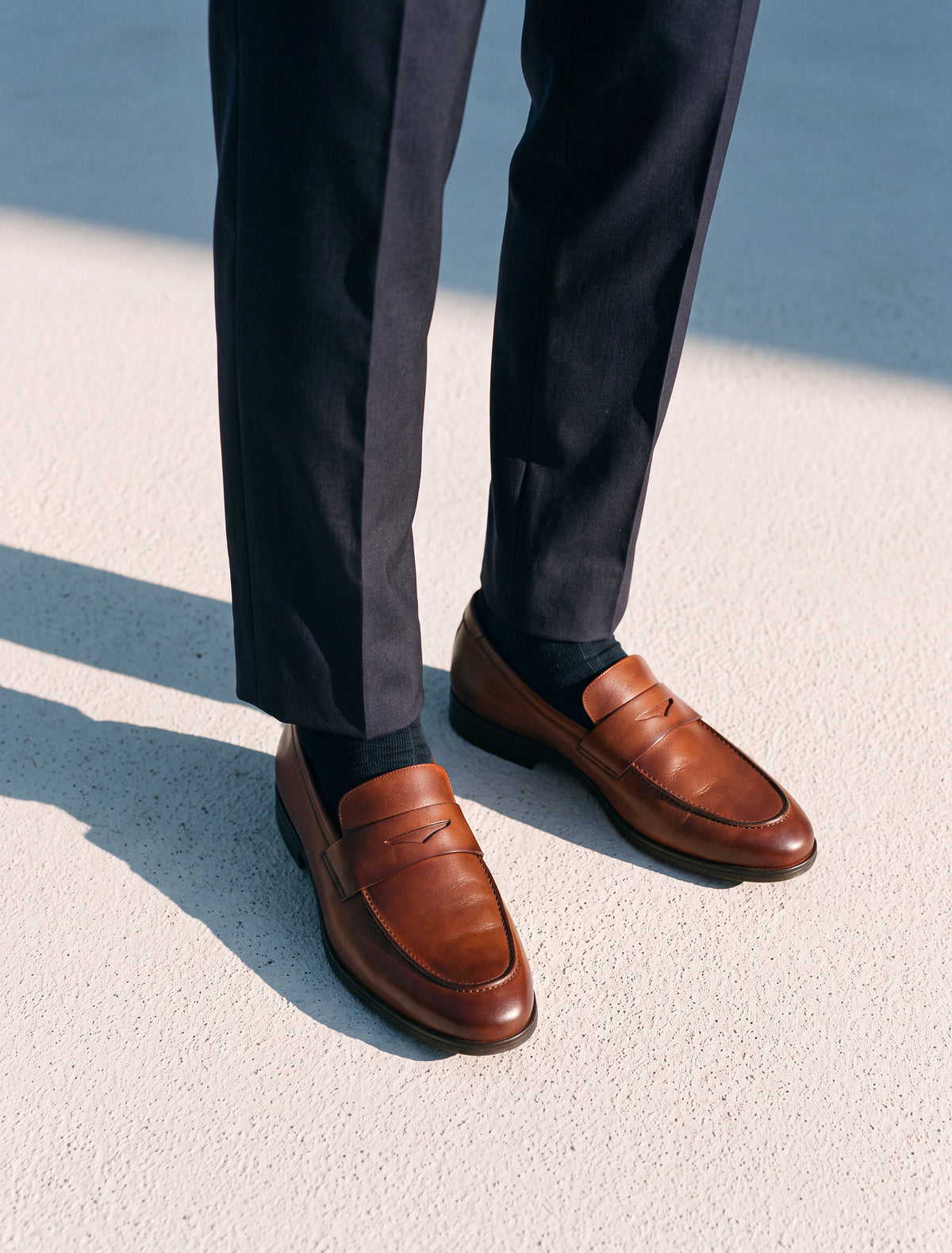
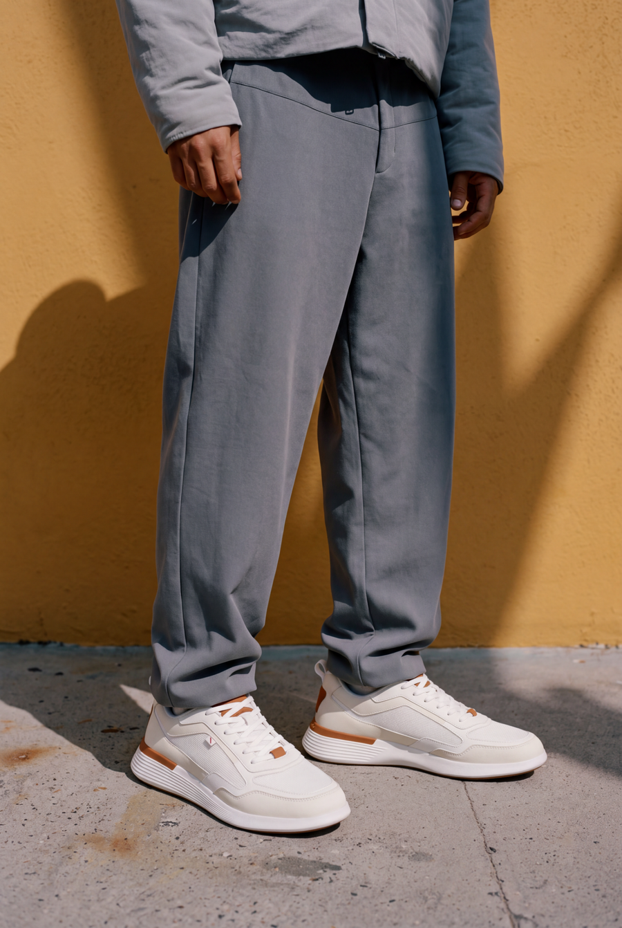
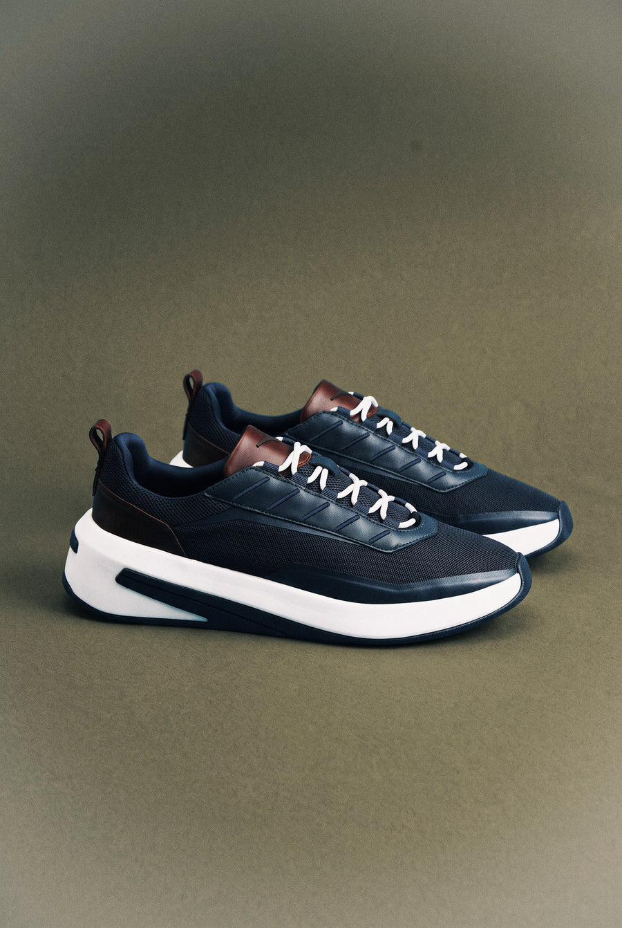
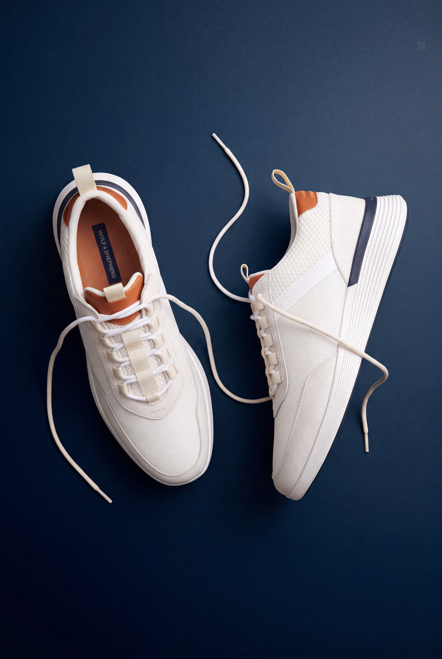
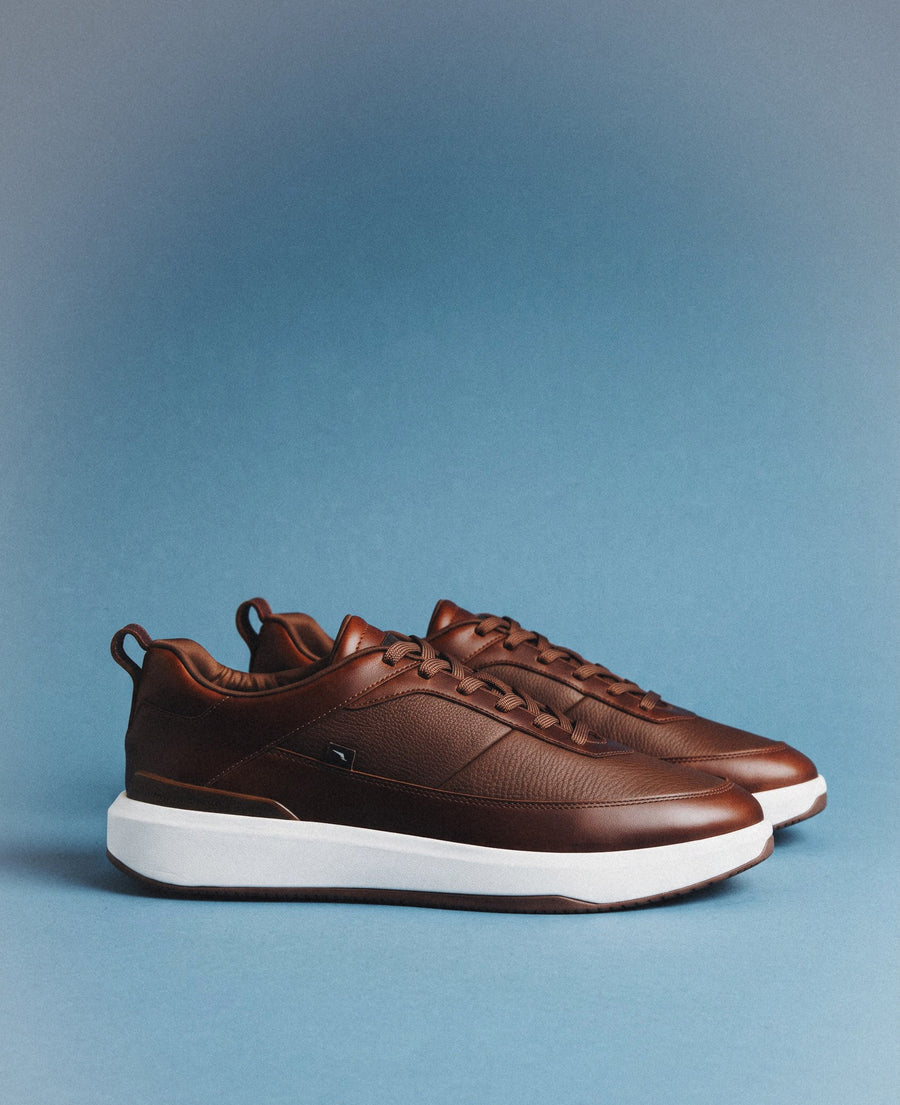
Photography moves at 0.6× scroll speed while the type lifts away faster, so the page gains depth.
02 · Type
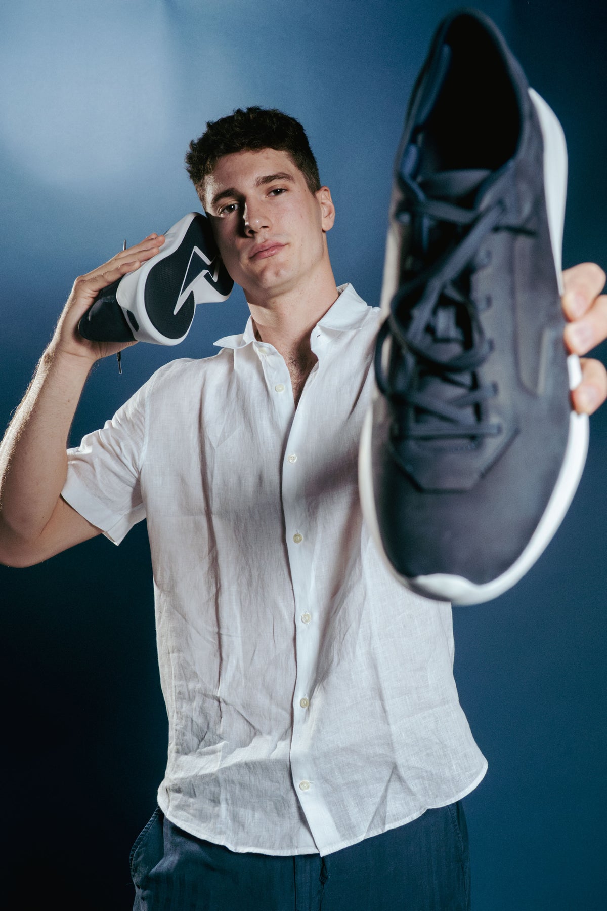
Headline lines drift in opposite directions, turning the brand promise into motion.
03 · Grid
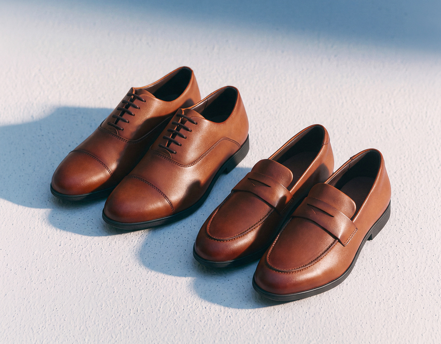
Columns scroll at different speeds, so the lookbook feels editorial rather than tiled.
04 · Product
Cards rise in sequence as the shelf enters view, guiding the eye toward the purchase.
01 / The business challenge
We were attracting attention. But were we giving customers enough confidence to buy?
Mobile represented roughly 90% of traffic, yet the reported conversion rate sat at 1.8%. The instinct could have been to redesign the homepage, sharpen the visuals or speed up checkout. None of those would necessarily solve the underlying problem.
I wanted to know whether we were facing a usability issue, a product-education gap, a mismatch between paid media and landing pages, or some mix of all three. Before deciding what to change, we needed to understand what was actually happening.
Core questions
Q1
Were campaigns setting expectations the landing pages failed to reinforce?
Q2
Did shoppers understand what makes the product worth the price?
Q3
Were fit, comfort, sizing and returns holding people back?
Q4
Where exactly did mobile shoppers lose momentum?
What 1.8% means in practice
At a 1.8% conversion rate, every 10,000 visits become roughly 180 orders. The other 9,820 were the real brief.
visits
orders
Intent journey →
Paid ad
Landing page
Product page
Size selection
Add to bag
Checkout
Purchase
02 / Research before redesign
I pushed for evidence before committing to a solution.
Diagram · how the brief was reframed
Initial request
Improve the website
A stronger homepage, better visuals, a faster checkout.
The real brief
Reframed challenge
Understand the customer
Where does purchase confidence break down, and why?
Better decisions before more design.
Early on there was an understandable desire to move straight into creative. The brand needed a stronger digital presence and the business wanted conversion to improve. My concern was that we’d end up making assumptions about customer behavior without enough evidence.
A more beautiful site might lift brand perception, but it wouldn’t necessarily resolve doubts about sizing, comfort or value. I recommended a research and measurement foundation first, framed not as a phase that delays design, but as a way to reduce wasted effort and make better commercial decisions.
03 / Research framework
Five lenses on one question: where does intent break?
01
Funnel analytics
Landing → PDP → size → bag → checkout → purchase, segmented by device, source and new vs returning.
Where does intent break down?
02
Interviews & usability
Recent buyers, first-time shoppers and non-purchasers completing real tasks on their phones.
What builds or undermines confidence?
03
Session replay
Scroll depth, repeated taps, errors, gallery and size-selector behavior.
Where is the interface confusing?
04
Voice of customer
Reviews, support tickets and returns, coded for fit, sizing and comfort concerns.
Which doubts keep recurring?
05
Paid-media audit
Ad promise, creative, landing page, stock availability and audience intent, side by side.
Is the story consistent from ad to site?
04 / Competitive landscape
We weren’t only competing on style. We were competing on confidence.

Amberjack
Leads with comfort technology, materials, fit guidance and returns, with occasion-based discovery.

Cole Haan · ZERØGRAND
Blends dress aesthetics with lightweight comfort and clearly named technical benefits.

Wolf & Shepherd
Performance-meets-premium positioning across Crossover™, SwiftKnit™ and other families. The story legible on a phone.
Compared on →
Comfort storytelling
Sizing reassurance
Product education
Mobile purchase UX
In premium footwear, people aren’t just comparing looks. They’re weighing comfort, quality, versatility and whether the price is justified, mostly without trying anything on. The site had to do more than present merchandise beautifully. It had to help people understand the product, compare options and feel sure about their choice.
05 / Synthesis & principles & HYPOTHESES TO VALIDATE
From a site organized around products and campaigns, to one organized around customer decisions.
Product understanding
Value isn’t immediately clear
Education & storytelling
Mobile discovery
Hard to browse and compare
Navigation & selection clarity
Purchase confidence
Fit, sizing & returns uncertainty
Contextual reassurance
Checkout
Too much effort at the finish line
Simplified mobile flow
Acquisition continuity
Ad-to-landing disconnect
Message-matched journeys
01
Explain value before commitment
Lead with why this shoe, before asking for a size.
02
Design for mobile first
The phone is the primary environment, not a compressed desktop.
03
Reduce uncertainty where it appears
Answer fit and returns questions at the moment they form.
04
Connect acquisition and commerce
Every ad promise is kept on the page it lands on.
06 / UX redesign workstreams
Five workstreams, one goal: make every step feel certain.
Workstream A
Mobile discovery
Clear categories, thumb-friendly controls and filters built around how people actually shop for shoes: by occasion, material and fit. Mobile is the primary environment, not a compressed desktop.
Occasion filters
Category chips
Thumb-zone controls


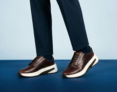
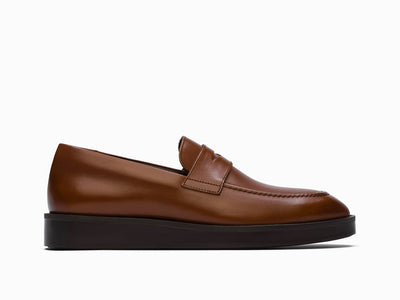
Workstream B
Product detail & fit confidence
Every element on the product page earns its place by answering a specific question: is this for me, will it fit, and is it safe to buy? Fit guidance lives next to the size picker; shipping and exchanges sit beside the button.


Crossover™ Victory Trainer
All-day cushioning
Dress-ready leather
No break-in
Select size
1
1
Education
Benefits in one glance
Added to bag
Crossover™ Victory Trainer
White / White · US 10
Complete the look

Low-show socks
+ Add

Shoe care kit
+ Add
Checkout
Keep shopping
3
3
Momentum
Cross-sell after commitment
Screen 01
Is this for me?
Gallery, on-foot imagery and three benefits up front, with depth one tap away.
Screen 02
Will it fit?
Size grid, fit scale and width notes in one view, so no detour to a size chart.
Screen 03
Is it safe to buy?
Shipping and exchange details visible before checkout, then relevant add-ons.
Workstream C
Product education
Material, cushioning, versatility and craft, woven into the shopping journey as short, benefit-led modules with optional depth. Never a long interruption between someone and the size picker.
Materials
Why full-grain leather wears in, not out
Comfort
What’s under the foot, in one line
Versatility
Office to dinner, shown on-foot

Upper
Full-grain calfskin, burnished by hand
Lining
Sheepskin lining, no break-in required
Why it’s comfortable
Athletic comfort, classic style.
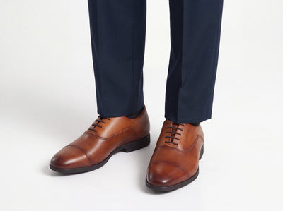
Hand-burnished leather and discreet StealthCELL™ cushioning, in a classic cap-toe Oxford.
Workstream D
Contextual cross-sell
Relevant colorways on the product page, accessories in the bag, care tips after purchase. Measured on relevance and revenue, never at the expense of checkout.

On the PDP
Also in Navy / White
In the bag
Low-show socks · Care kit
After purchase
How to care for leather
Workstream E
Checkout
Guest checkout by default, express payment where supported, clear totals, shipping shown early and concise error states. Fewer decisions, all in thumb reach.
1 · Product
2 · Bag
3 · Checkout
Crossover™ Victory Trainer
White / White · US 10
Add to bag
Free shipping over $150
Guest checkout
07 / Paid media & conversion
The customer journey didn’t start on the website.
Much of the experience was shaped before anyone reached the site. If a campaign introduced a specific product, comfort benefit or styling idea, the landing experience had to reinforce that promise immediately. I wanted acquisition and the digital experience to work as one connected journey, not as separate creative and performance efforts.

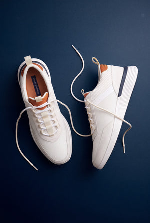 Crossover™ Victory Trainer · $250
Message match
Same headline
Same imagery
Same promise
Same product & colorway
Illustrative creative
Comfort
Cushioning, fit, everyday wear
Engagement, add-to-cart
Style
Outfit versatility
Discovery, conversion
Product-specific
Exact product and colorway
Landing-to-PDP progression
Returning shopper
Relevant recommendations
Repeat purchase, revenue/session
08 / AI-assisted prototyping
Faster iteration, with judgment in the loop.
Revisiting this work in 2025, I used tools like Figma Make, Claude and Cursor to move from wireframe to an interactive, coded prototype of the same task: choosing a size and adding to bag. These tools weren’t part of the original engagement [confirm]. They compress the distance between an idea and something people can actually test, but they don’t decide what’s right.
01 · Wireframe
Hierarchy, real content and the four decisions on the page, annotated.
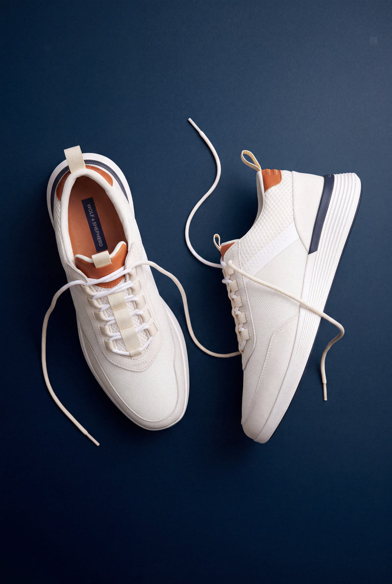
02 · Coded prototype
Every real state: in stock, low stock, sold out and the missing-size error.
03 · Polished screen
Select a size, add to bag, confirm in a cart sheet. One continuous motion.
Where I overruled the generated output
Accessibility
Rejected low-contrast pills and cramped tap targets. Every size now has a clear, high-contrast selected state.
Clarity
Replaced unlabeled icons with words people use when they shop for shoes.
Edge cases
Added half sizes, low stock, sold-out and wide-fit states the first pass ignored.
Brand integrity
Removed generic e-commerce patterns that flattened the premium feel.
09 / Testing & measurement
Every design bet paired with a measurable hypothesis.
Fit education builds confidence
Contextual fit module
Add-to-cart rate
Proposed
An accessible CTA improves progression
Sticky mobile CTA
Add-to-cart rate
Proposed
Less friction improves completion
Simplified checkout
Checkout completion
Proposed
Message continuity lifts efficiency
Matched landing pages
Revenue per landing session
Proposed
Relevant add-ons raise basket value
Contextual cross-sell
Revenue per session
Proposed
What a relative lift would mean
Guardrails →
Return rate
Support contacts
Page speed
Discount effects
Average order value
Acquisition cost
10 / Visual identity & system
A premium brand deserves a digital experience that feels equally considered.
Wolf & Shepherd balances the sophistication of traditional footwear with the energy of athletic performance. The system carries that balance through disciplined typography, quiet color, generous spacing and components that behave the same everywhere, from the collection grid to checkout.
Brand direction · my part
The wordmark already held the idea: a dress-shoe structure with an athletic lean. My focus was making everything around it say the same thing, so the site, the campaigns and the product pages all describe the same person. Clear principles gave the team a shared filter for imagery, styling and motion, and the films below show that direction in practice.
01
The man, not the model
Real places and everyday confidence. City streets, stairs and offices, never a studio pedestal.
02
Movement over poses
Low angles and mid-stride frames keep the shoe in motion, where the comfort story is believable.
03
Dress casual as the default
Tailoring with sneakers, loafers with a sharp suit. Styling that proves the shoe works all day.
The direction, in motion
Tap a film to watch
Color
Navy
#081326
Surface
#0E1D36
Cobalt
#5C94FF
Ivory
#F4F1EA
Type
Aa
Inter Light · Display & UI
Aa
Inter Display · Labels & UI
SIZE · US 10
Tabular figures · Sizes & prices
Overlay components
Status tag
Free shipping over $150
Spec hotspot
Material callout
Crossover™ Victory Trainer
White / White · US 10
Add to bag
Size selector · states
Default and selected states, readable at a glance, with every size at least 40px tall.
11 / Outcomes & reflection
What shipped
Website relaunch
Decisions influenced
Research first, plan then design
What was measured
CVR, ATC, mobile optimization
The hardest part wasn’t designing the solution. It was making sure we understood the right problem.
Looking back, it would have been easy to treat this as a conventional e-commerce redesign. The business had performance concerns, the brand had room to evolve and there were obvious things to change. The most valuable part was questioning those assumptions early.
Good design isn’t only about making an experience easier to use. It’s about understanding which problems matter, why they matter, and where thoughtful design can make the biggest difference.
Want to
see more?
Reach out to view more of my portfolio work – including projects from Disney, Wolf & Shepherd, Franklin Templeton, Block One, and JPMorgan.
