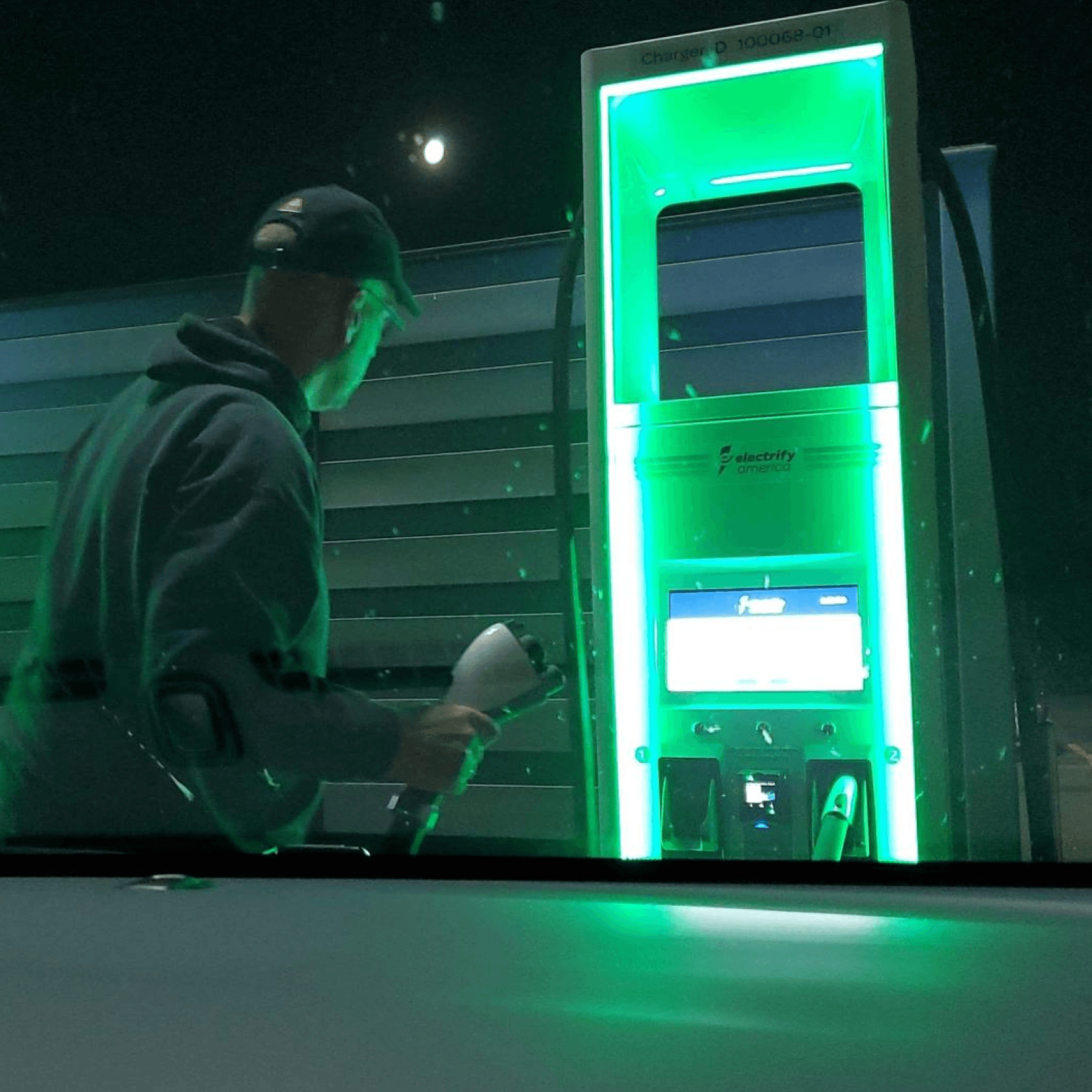
Hosted LA Tech Week Event

Electrify America

Take charge of your EV

Product Design

UX Research

Branding
Brand identity · Charging UX

Neutral by design.
Electric by nature.

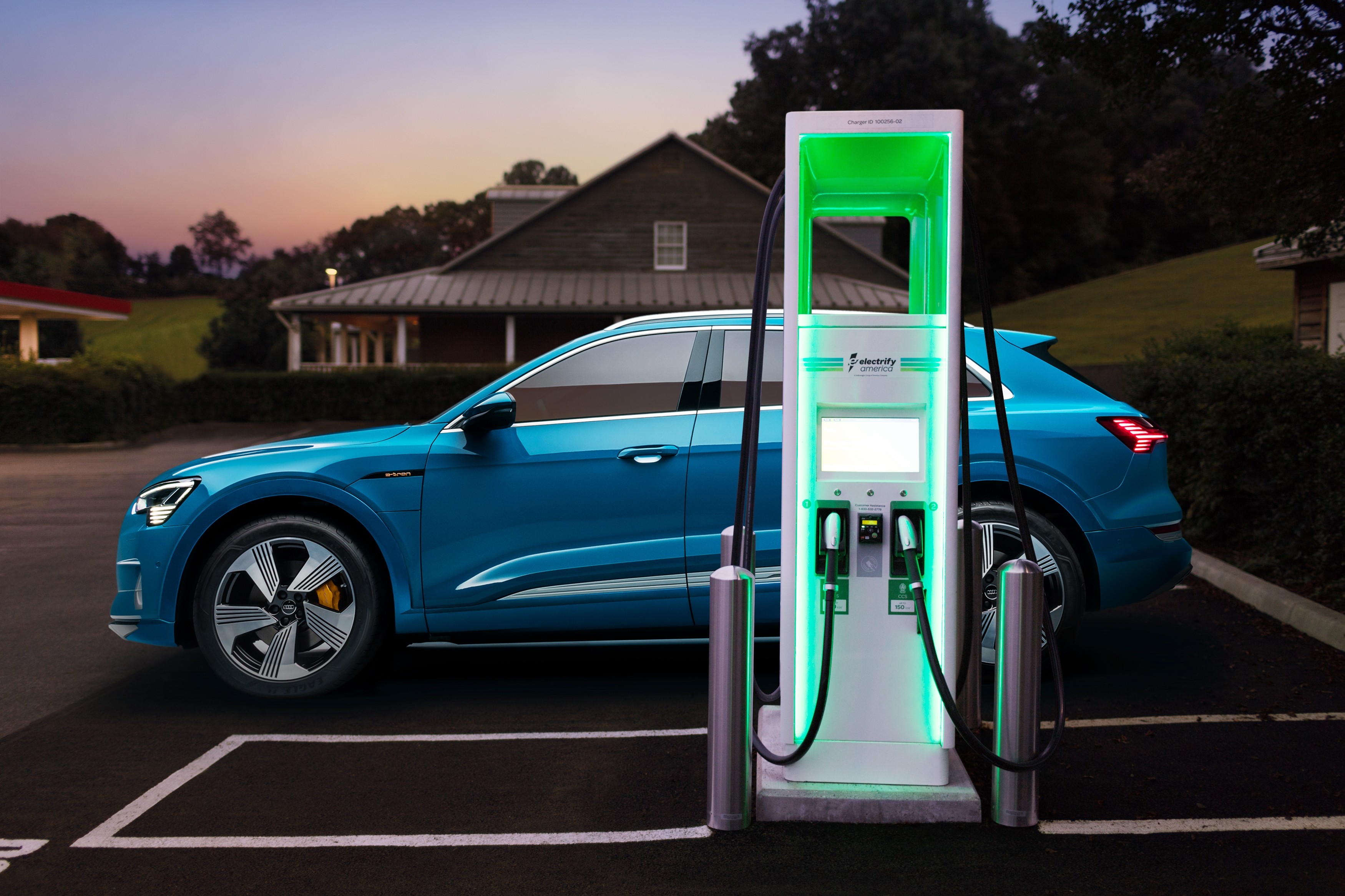
A charging network for every EV, not one carmaker’s. I designed the logo and identity, then carried it into the chargers and the apps drivers use to find, start and pay for a charge.

01 · The origin
Born from a settlement
Electrify America was established by Volkswagen as part of its settlement following the Dieselgate scandal.
02 · The brief
Neutral by design
Create a neutral, technology-focused brand identity, and an intuitive interface across the chargers and the mobile apps.
03 · The scale
Charging, nationwide
Partnering with Stable Auto, a San Francisco EV fleet charging company, to innovate and scale charging across the U.S.
Find a charger
Customer voice
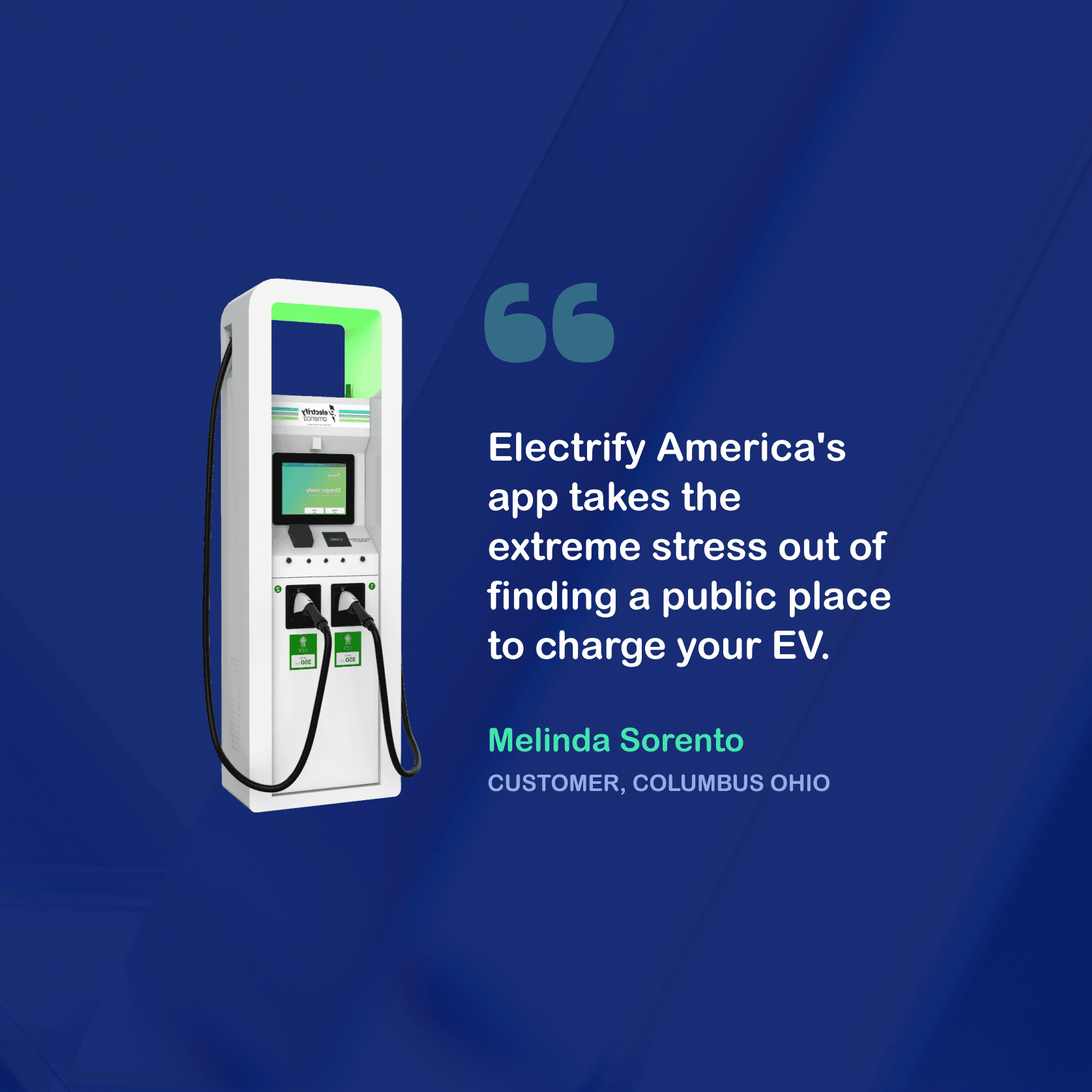
“Electrify America’s app takes the extreme stress out of finding a public place to charge your EV.”
electrify america Port 1 · 150 kW 0% Charging your vehicle Charging complete 100% · Ready to go
Charging · 0%
Melinda Sorento
Customer · Columbus, Ohio
01Understanding the problem

Charging an EV shouldn’t feel like a gamble.

Electrify America was building a national fast-charging network from the ground up. Before designing a screen, I set out to understand what made public charging stressful today, and where the industry believed charging was heading tomorrow.

Drivers
Listening to EV drivers
How they plan a trip, pick a station, plug in and pay, and the moments where confidence drops.
Industry
Talking with European auto brands
How carmakers further along the EV curve saw ownership, charging and the role of the network evolving.
Journey
Mapping every step
Breaking one charging session into each decision, from the night before a trip to driving away.
What drivers told us
Five moments where trust broke
01
Range anxiety on longer trips
Not knowing if the next station will be there, or working.
02
Arriving to a busy or broken charger
Status was a guess until you pulled in.
03
Connector confusion
CCS, CHAdeMO, kW ratings. New drivers weren’t sure what fit.
04
Price after the fact
Cost only became clear once the session ended.
05
Waiting blind
No sense of when the car would be ready to leave.
Where the industry was heading
Takeaways from European brands
Charging becomes ambient
Plug in and walk away. The car identifies itself and billing just happens.
One account across car, app and charger
The driver shouldn’t have to manage three relationships.
The network is the brand
Reliability and clarity build more trust than peak-speed specs.
This shaped the brief: design for today’s anxious first-timer, without blocking the hands-off future.
02Mapping the charging journey
The app’s job: keep stress flat from plan to pay.
Without the appWith the app
More stressCalm
Plan
Route + station status
Find
Live availability by connector
Arrive
Charger ID + directions
Plug in
Start from the app
Charge
Live % · cost · time left
Pay + go
Auto receipt, nothing to tap
This chart is an illustrative synthesis of driver research, grounded in actual data I collected during research gathered on the project.
03Research workshop

Before any screens, we drove the journey and wrote down every question.

In a research workshop we walked one charging session stop by stop, from planning the trip to driving away, and noted what a first-time EV driver is asking at each moment. Those questions became the brief for the app.

parklakerange anxiety lives here1. Plan2. Find3. Arrive4. Plug in5. Charge6. Pay + goN
One charge, start to finish.
What is the driver asking at every stop?
Plan
Will there be a working charger on my route?
Find
Is it busy? Does my connector fit... CCS or CHAdeMO?
Arrive
Which charger is mine, and is it actually working?
Plug in
How do I start it? App? Card? Something else?
Charge
How long will this take, and what is it costing me?
Pay + go
Do I have to do anything to pay before I leave?
status = a guess until you pull in
auto brands: charging gets ambient. plug in & walk away
the network IS the brand
brief: calm the anxious first-timer, without blocking the hands-off future
I really did draw out a map! I recreated this map from my workshop notes. Questions synthesized from driver research and drawings I put together to fully understand the journey.
04The app, up close

One calm thread from search to receipt.

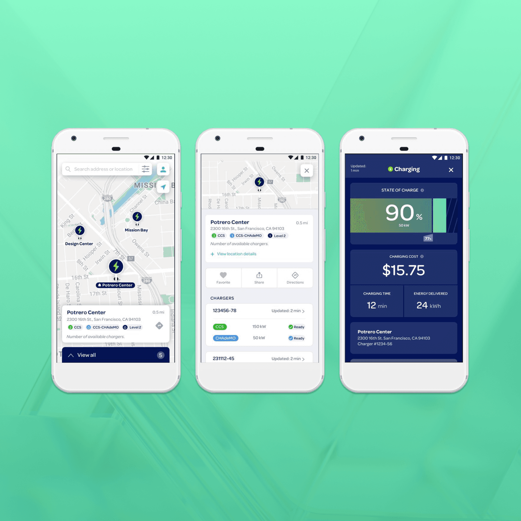
I redesigned the core flows around the five trust breakers from research. Each screen answers the one question a driver has at that moment.

05Brand mark & UI kit

I designed the mark, then built the app’s kit around it.

The logo folds a lightning bolt into the e, so the name and the idea of charging read as one. Its teal-to-lime gradient became the energy color of the app: progress, status and anything live.

Electrify America · Primary lockup · Construction
10.4x4.4xxx23.8°clear space = x on every sidex = height of the e
Primary · on navy
Primary · on light
Mark · app icons
App UI kit · sample
Color
Navy
#14236B
Royal
#1E3290
Teal
#34C3D3
Mint
#7DF7C4
Lime
#A6E05A
Charge
Teal Lime
Type · Rubik
Aa
Light · Regular · Medium · Semibold
Display 3090% charged
Title 19Potrero Center
Body 14.52 chargers ready nearby
Caption 11.5UPDATED 2 MIN AGO
Buttons & controls
Search address or location
Station card
Potrero Center
0.5 mi
2300 16th St., San Francisco, CA 94103
2CCS2CHAdeMO2Level 2
Live session
Charging
90%
Cost
$15.75
Time
12 min
Energy
24 kWh
Status · icons · feedback
ReadyIn useOfflineReserved
Charge
Location
Favorite
Share
Directions
Filter
Account
Receipt
How was this charger?
06What I did

Brand, product and station, designed as one system.

I led the work from the identity through to the app and the physical charger, so every touchpoint feels like the same brand.

01
Brand identity
Designed the logo and a cohesive, neutral identity system that reflects Electrify America’s mission.
02
Product brand
Defined a modern, approachable, technology-forward brand language for the app and the stations.
03
UX/UI design
Designed the driver experience end to end, from the station screen to the mobile app.
04
iOS and Android
Built one consistent app experience across both platforms.
05
Visual design and art direction
Set a clean, forward-looking visual style across every touchpoint.
06
Photography
Shot the stations and the app for launch and marketing materials.
07How it came together

From workshops to a national rollout.

Phase 1
Discovery workshops
  • Ran discovery workshops with Electrify America stakeholders and Stable Auto.
  • Explored the physical and digital charging experience together.
  • Defined how the station should look and work: visible, accessible, easy to use.
Phase 2
Designing the station
  • Prototyped the charging station with the engineering team.
  • Added LED lighting so drivers can spot a station from a distance.
  • Designed a simple touchscreen for starting and managing a charge.
Phase 3
Research and app design
  • Ran interviews and surveys on what frustrated drivers about charging.
  • Aligned with engineering on technical constraints and opportunities.
  • Designed the app: find a charger, pay your way, track sessions, get alerts.
Phase 4
Test market
  • Launched a beta of the station and app in a test market.
  • Used data and customer feedback to find where it fell short.
  • Made significant updates to both before the national rollout.
Phase 5
National rollout
  • Launched nationwide alongside a growing network of stations.
  • Passed 1 million app downloads.
08How I worked

A process built for hardware and software together.

01
Requirements
Interviewed stakeholders to define goals and constraints, then built a roadmap connecting physical and digital touchpoints.
02
Research and insights
Benchmarked competitors and ran focus groups with EV drivers, then turned the findings into key design decisions.
03
Ideation and prototyping
Sketched station and app concepts, built wireframes and low-fidelity prototypes, and iterated quickly with users.
04
Working with engineering
Kept designs feasible without losing quality, bridging hardware and software into one connected experience.
05
Testing and refinement
Ran usability tests in the test market and updated the app and station interface based on what we learned.
06
Launch and optimization
Delivered a polished experience across app and station, then kept improving from reviews and analytics.
09Results

One charging experience, from the station to the phone.

1M+
App downloads
Nationwide
Rollout after a test-market beta
2
Touchpoints, one experience: station and app
LED-lit stations that became instantly recognizable from the road.
A neutral, confident identity that helped position Electrify America as a leader in EV charging.
What made it work
I tested with drivers early and often, kept iterating, and stayed close to the engineers building the hardware.
10Measurable impact

One app, one network, and drivers who kept coming back.

What changed after the app and stations launched nationwide.

−65%
Support calls
Clear session start and in-app troubleshooting removed the most common reasons drivers called.
4.7★
App store rating
Rated highly for ease of use, finding stations and paying, across iOS and Android.
$120M+
Fuel savings for drivers
Estimated savings versus gas over three years for drivers charging on the network.
+200%
Network usage, year over year
As the app improved, more drivers made it their go-to for finding and starting a charge.
1.27%
Faster session turnover
Real-time availability and navigation get drivers in and out quicker, so each station serves more people.
−6.4%
Operating cost
Route planning and load balancing helped use energy more efficiently across the network.
North-star metric
Network usage, indexed to launch year
1×3×Result
Usage grew 200% year over year as the app became the way drivers found, started and paid for a charge. The app passed 1 million downloads.
BeforeLaunchYear one

Want to
see more?

Reach out and I’ll walk you through more of my work, including projects for Disney, Wolf & Shepherd, Franklin Templeton, Block One, and JPMorgan.

Reach out to view more of my portfolio work – including projects from Disney, Wolf & Shepherd, Franklin Templeton, Block One, and JPMorgan.

Current availability

We’re open for business and new collaborations.

Current availability

We’re open for business and new collaborations.

Live sites I designed