Hosted LA Tech Week Event

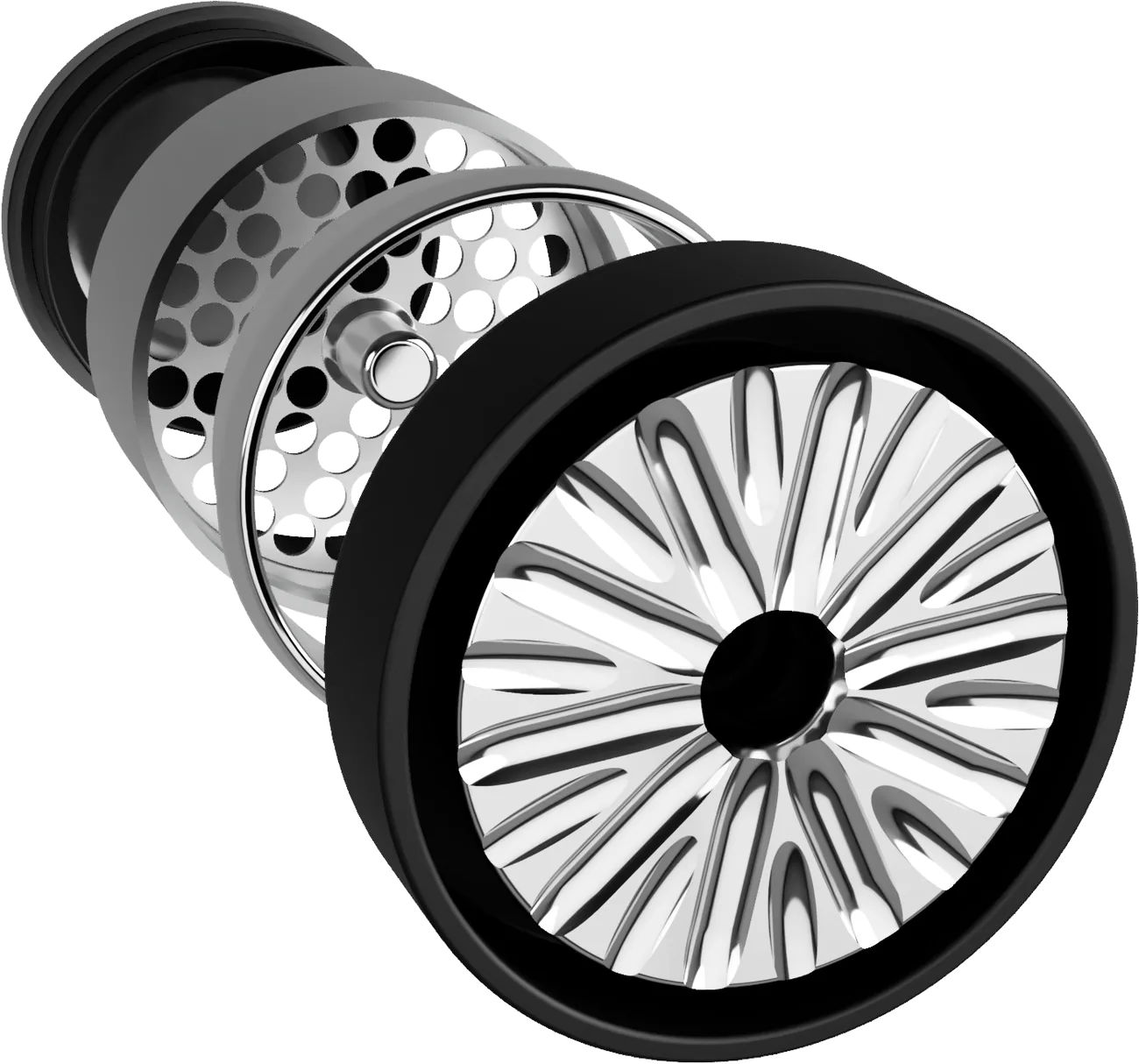
Flower Mill Premium Edition, exploded: rotor knob, stainless milling chamber and plate, lower catch

A different kind

of grind.

A mill, not a grinder. I gave that difference a brand: one mark, one gold, and packaging that explains itself.

Brand identityPackagingArt directionGuidelinesSales collateral
Scroll
01The premise

Great products deserve equally considered brands.

A Phoenix studio founded by former performance automotive engineers. Three years of prototyping produced a mill that crumbles instead of shreds. It launched in 2020.

The product worked differently. The brand didn't say so yet. My job was to make that difference obvious.

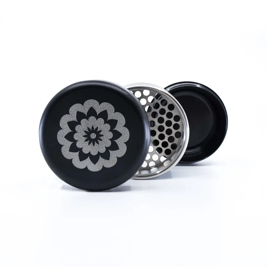
Flower Mill Premium Edition in three pieces: flower-engraved lid, stainless milling chamber, black lower catch
Client
Flower Mill
Phoenix, Arizona
When
2021 – 2022
My role
Brand & packaging designer
Disciplines
Identity, packaging, art direction, guidelines
Delivered
Logo system and brand guidelines · Premium paper tubes in three colorways · Retail six-pack · Plate kit and accessory boxes · Wholesale sheets · Trade-show graphics
02The category

The category had conventions. The product challenged them.

Grinders cut with teeth. Flower Mill crumbles with a 20-flute rotor over a perforated plate. Drag to compare.

Flower Mill rotor knob with 20 flutes, center housing and lower catch
Mill
20-flute rotor · Flower Mill render
Grind
Typical toothed grinder · illustration
On the Premium six-pack panel
No teeth
Extra fluffy
Easy to clean
Huge capacity
I
Say mill, not grind.

The product does something different, so the language should too. “Mill – Don’t Grind” became the line on every box.

II
Let the hardware lead.

Real renders of real parts. No leaves, no smoke, no neon. The machined aluminum is the most persuasive thing we have.

III
Show quality before use.

Most people meet the brand on a counter or in a shipping box. The packaging has to carry the product’s precision on its own.

The opportunity wasn’t to make Flower Mill look expensive. It was to make its value unmistakable.

03The direction

From product innovation to brand expression.

Precision
Details that show care.
In the work

Dielines dimensioned to the millimeter: a 73 mm lid, a 48 mm body, a 25 mm cap.

04The flower mark

One symbol. An entire identity.

Twelve outer petals, twelve inner, a star at the center. A flower, a milling plate and a machined part, all at once.

Approved lockup · from the brand guidelines
Gold on white
White on gold
Black on white
Gold on black
White on black

Five approved color pairings and no others. Gold only sits on a ground with no other color, so it is always the one special thing.

05The visual system

A system built around intention.

Four primaries, three tube colors, one foil. A grotesk that sets like an engineering label, an italic serif for emphasis. The product stays the loudest thing.

Primary color
Black
Rich black
Pantone Black C
#2D2A26
Pantone 871 C
#85754E
C44 M45 Y75 K17
Steel
#C4C4C4
Paper tube & foil
Pantone 423 U
#9DA2A8
Black & Grey
Pantone 7605 C
#E1C2B0
Black & Rose Gold
Pantone 7712 U
#00779F
Black & Blue
Gold foil
Lids, six-pack, plate kit
Typography
AaAa
Neue Montreal Bold
Neue Montreal Regular
Italic serif, for emphasis
Shown here in web stand-ins. Headlines bold, body regular, one italic per layout at most.
Voice
Mill – Don’t Grind
“Patent-pending design progressively crumbles flower for a more fluffy, uniformly burning result.”

Short and factual, like a spec sheet. Both lines come straight from the production packaging.
Photography
Studio photograph of the Flower Mill Premium Edition on a white sweep

White sweep, real hardware, a low camera so the flower faces you.
Guidelines · page 21 of 23
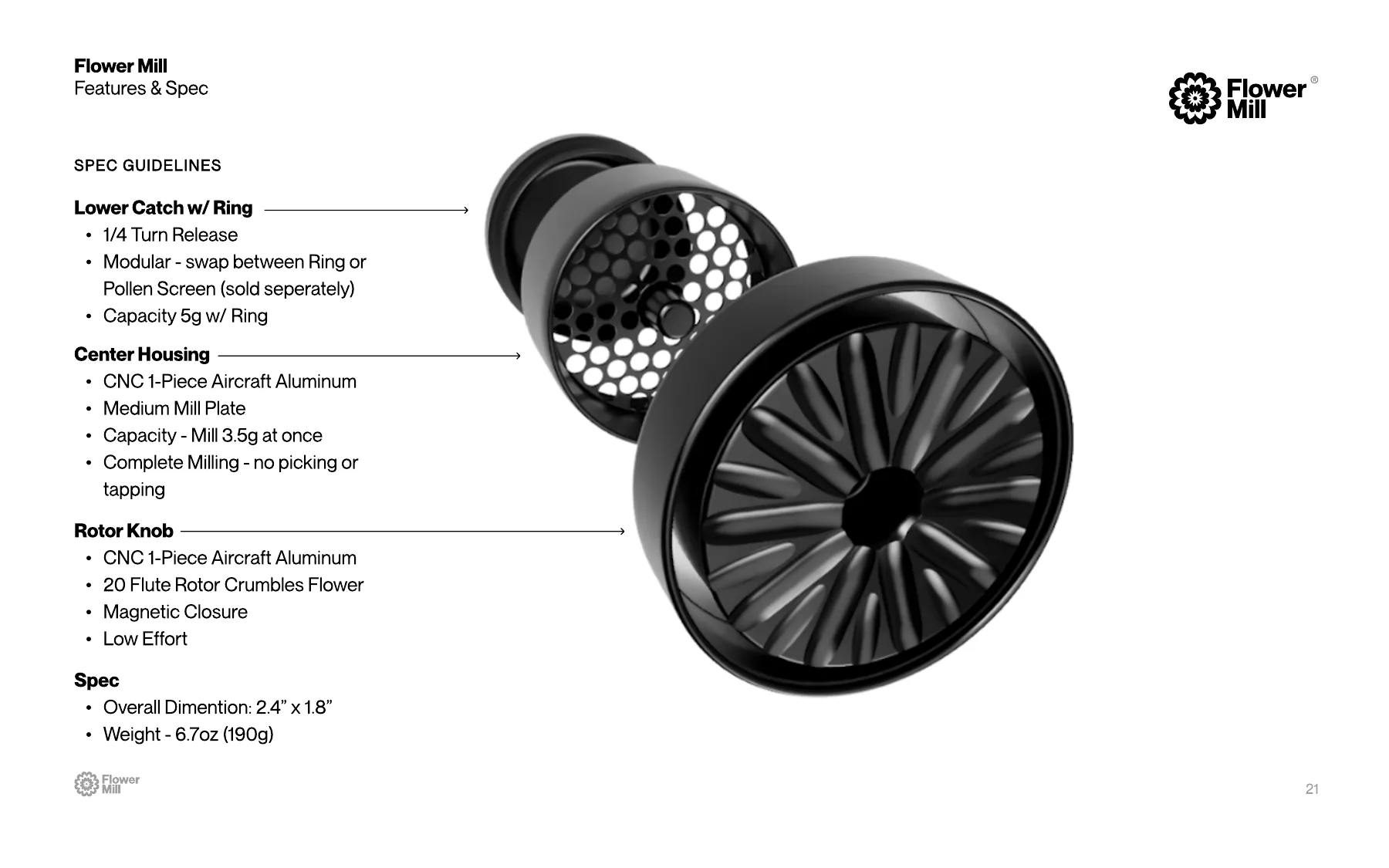
Flower Mill brand guidelines, features and spec page

23 pages: identity, color, type, booth signage, every packaging format and the spec sheets.

06Gold as a material

A different kind
of finish.

Foil on the lids, the six-pack and the plate-kit box. Used sparingly, so it always feels special.

Foil rendering · portfolio visualization
Where the foil lives.
Production artwork
Tube lid
Gold foil · dieline
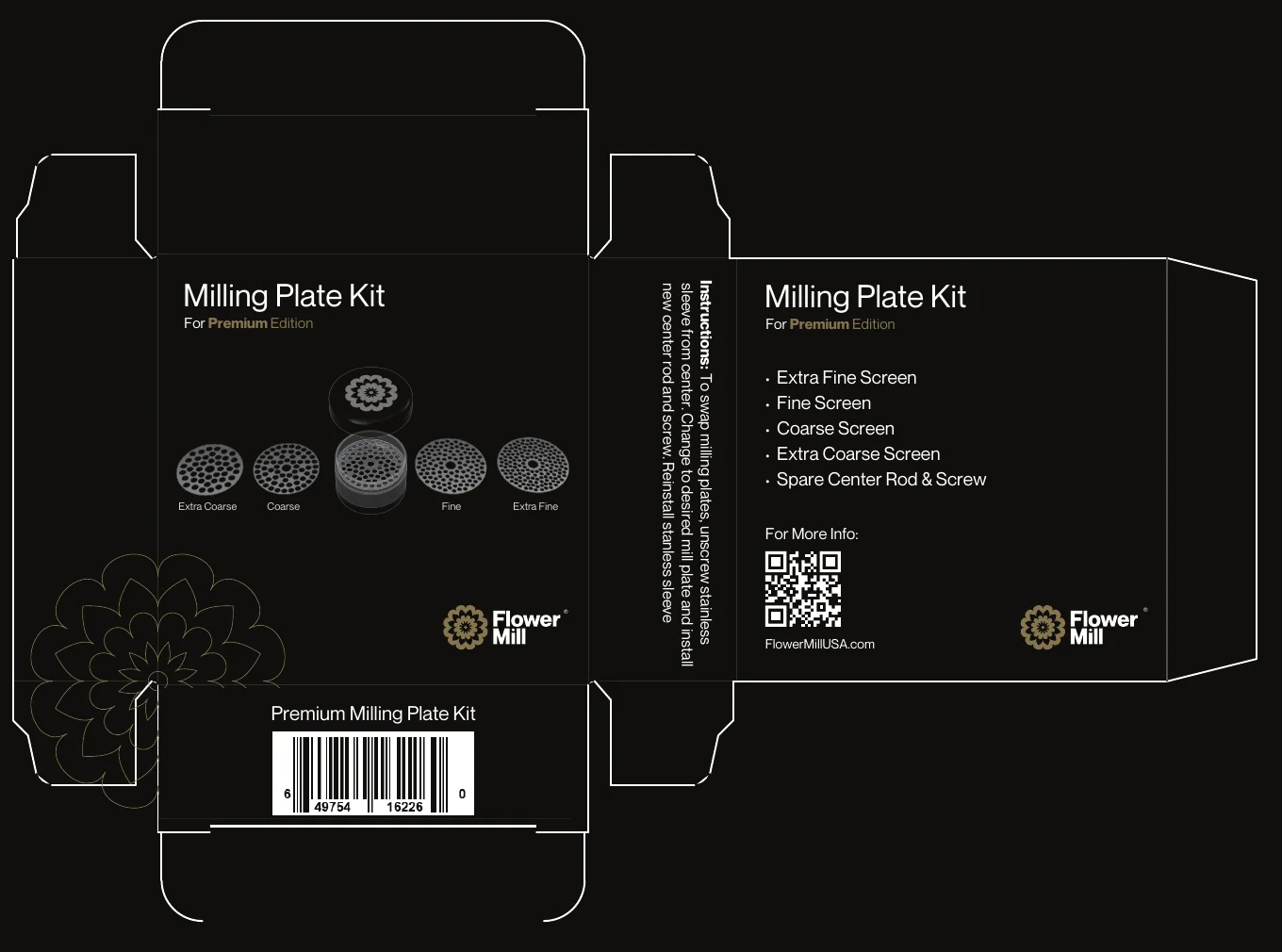
Milling Plate Kit
Foil on Pantone Black C
Premium six-pack
Foil · counter display
Booth C2 footer
Gold leaf · trade show
07Packaging

The experience begins before the product is opened.

A matte black paper tube, the flower in gold foil on the lid, and an inner tube in the mill's accent color. Grey, rose or blue tells you what's inside before you read a word.

3D built from the production dieline · scroll to wrap
Body wrap · 48 mm · Premium Stainless EditionLid · Ø 73 mm, gold foil
Colorway
Pantone 423 U · inner tube matches the mill
One family, five formats.

Premium lives on black and gold. Accessories and Standard switch to white stock and one lime strip, so the tiers read apart across a shop. Every piece is a production dieline.
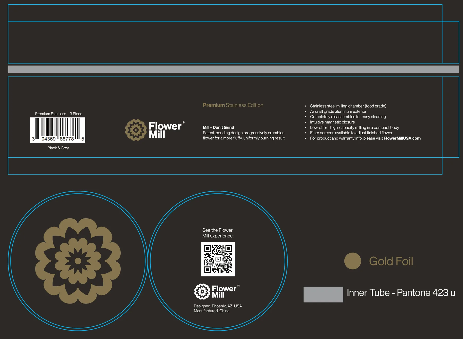
Premium paper tube
Premium paper tube
Dieline · body, lid and base in three colorways
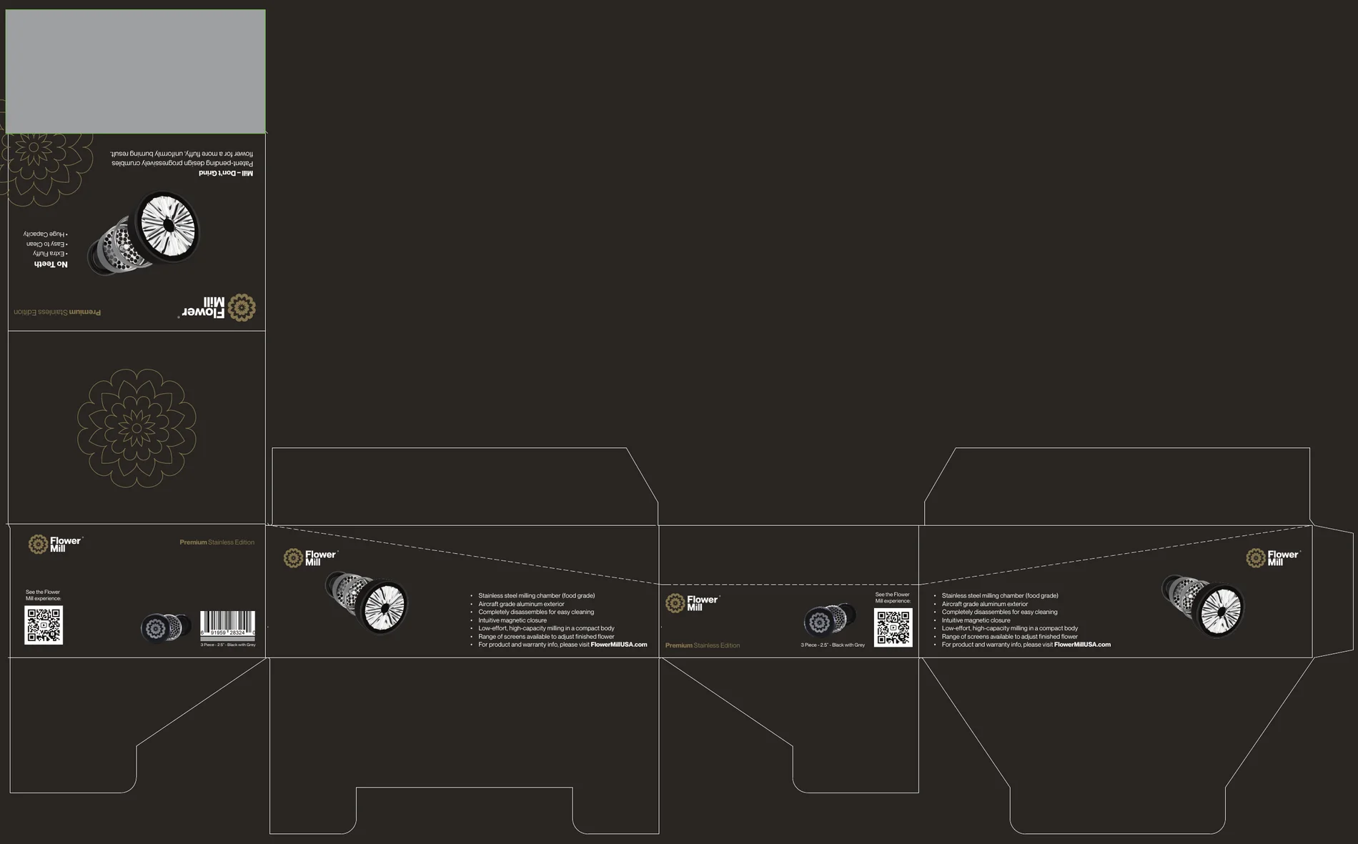
Premium six-pack
Premium six-pack
Counter display · Pantone 423 U interior, gold foil
Milling Plate Kit
Milling Plate Kit
Tuck box · Pantone Black C, gold foil
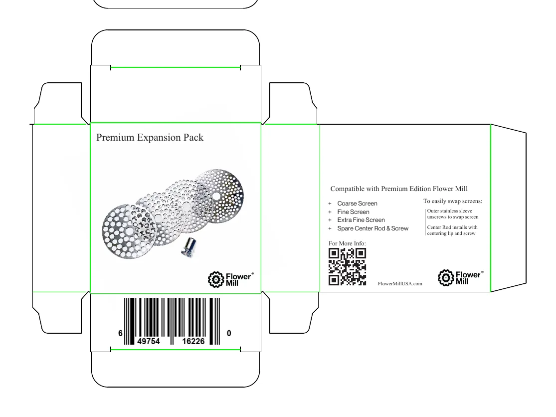
Premium Expansion Pack
Accessory box · white paper stock
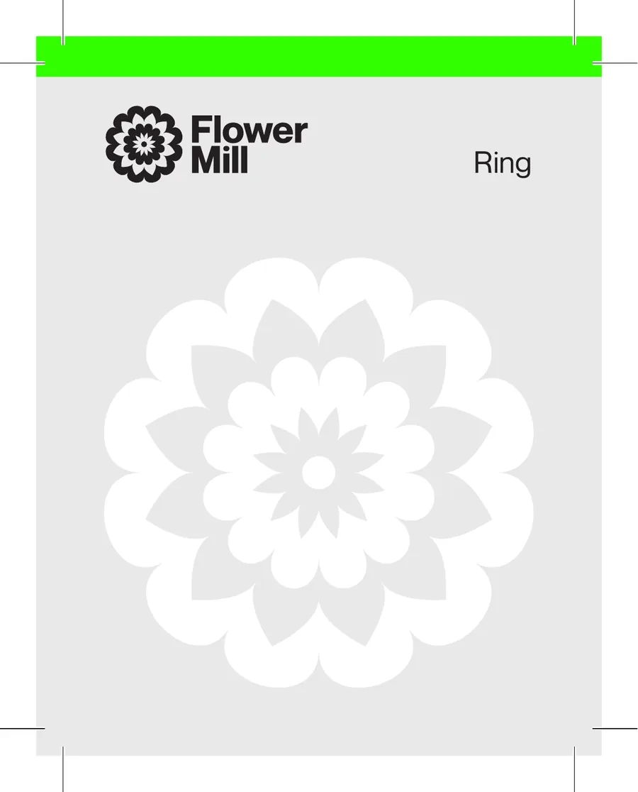
Ring accessory
Ring accessory
Clamshell card · Standard range lime strip
08Engineered differently

The details make the difference.

The Flower Mill team engineered the hardware. I made it legible: a spec layout for the guidelines and the trade, and a visual language taken from the parts themselves.

Flower Mill exploded: lower catch with ring, center housing with mill plate, 20-flute rotor knob
01Lower catch with ring
  • Quarter-turn release
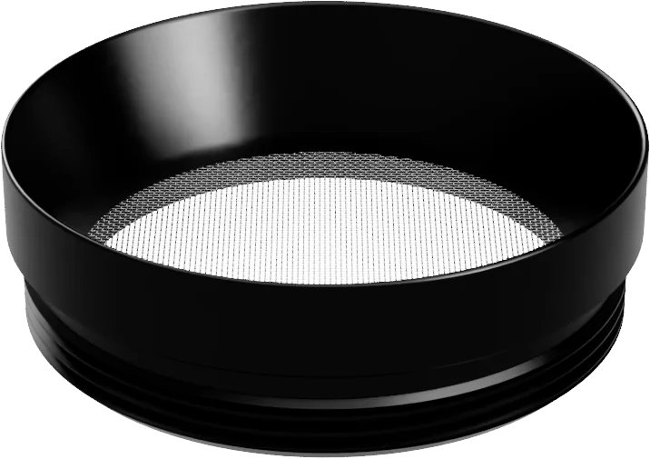
  • Swap the ring for a pollen screen
  • Holds 5 g with the ring
02Center housing
  • CNC one-piece aircraft aluminum
  • Medium mill plate
  • Mills 3.5 g at once, no picking or tapping
03Rotor knob
  • CNC one-piece aircraft aluminum
  • 20-flute rotor crumbles flower
  • Magnetic closure, low effort
2.4 × 1.8 in · 6.7 oz (190 g) · from the spec sheet
Five plates. Your consistency.
#3 Medium ships in the box · plates drawn as line art
#1 Extra Fine
#2 Fine
#3 Medium
#4 Coarse
#5 Extra Coarse
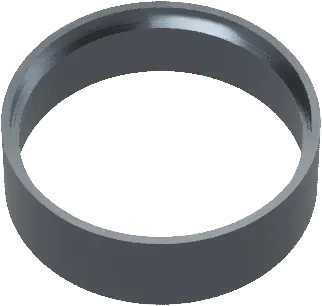
Ring
Ring
Included · 5 g capacity
Off
Unscrew to swap
Pollen screen
Pollen screen
Sold separately · 3.5 g
09The brand in motion

Built to move. Designed to be remembered.

The original work was print and packaging. For this page I defined how the identity moves: four studies, four rules, one curve.

Portfolio extension · not a delivered asset
Lockup
The mark turns into place, the word follows
Plate geometry
Perforation rhythm as a transition
Pattern
The flower repeats, tonal and quiet
Material
Gold gives way to matte black
Duration

Interface moves take 200–300 ms. Product and identity moves take 900–1,400 ms, slow enough to read as weight.

Easing

One curve everywhere, cubic-bezier(.22, 1, .36, 1). A quick start and a long settle, like a knob coming to rest.

Direction

Rotation always resolves to the mark’s upright position. Things enter from the edge they’d physically come from.

Restraint

One moving thing per view. If two things move, one of them shouldn’t.

10Beyond the package

One identity. Every touchpoint.

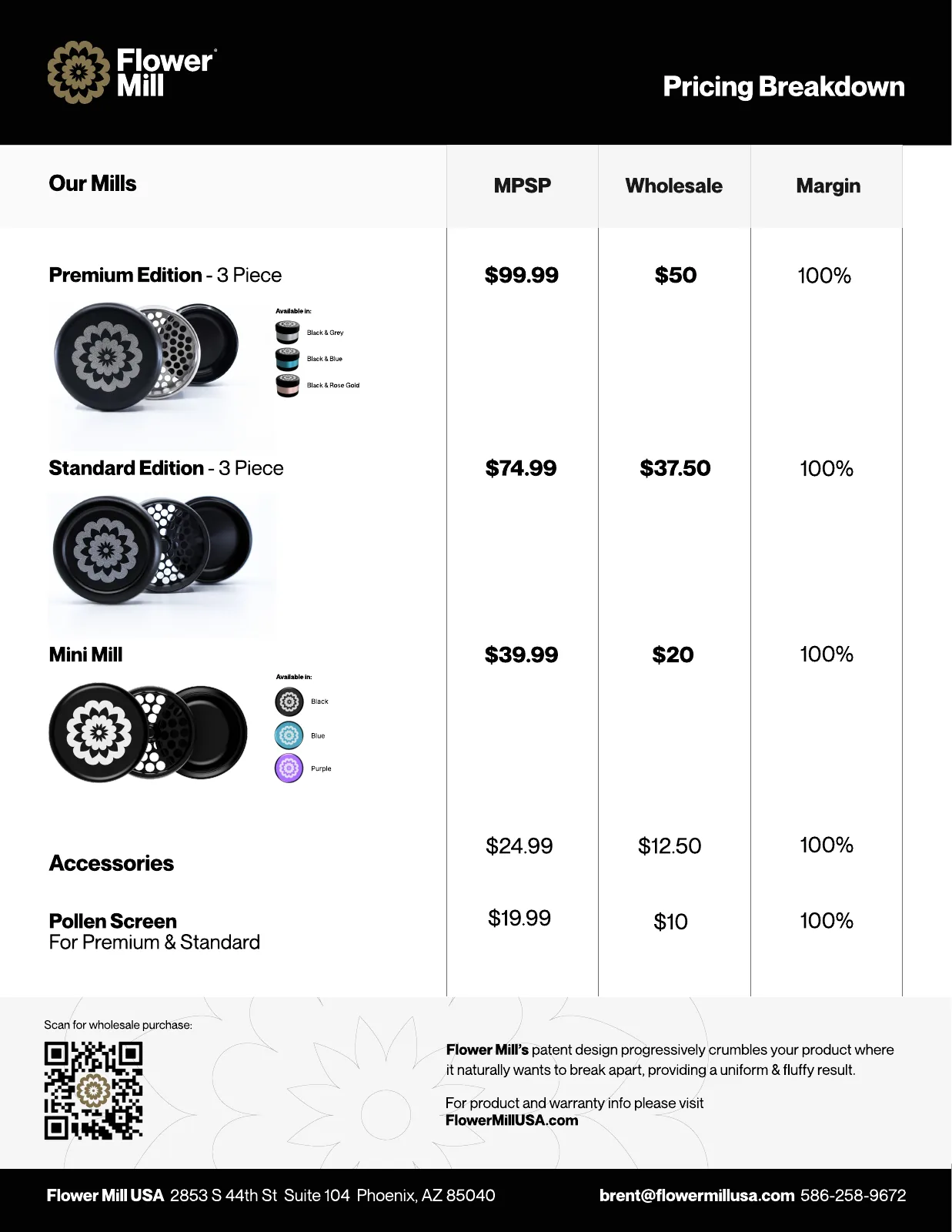
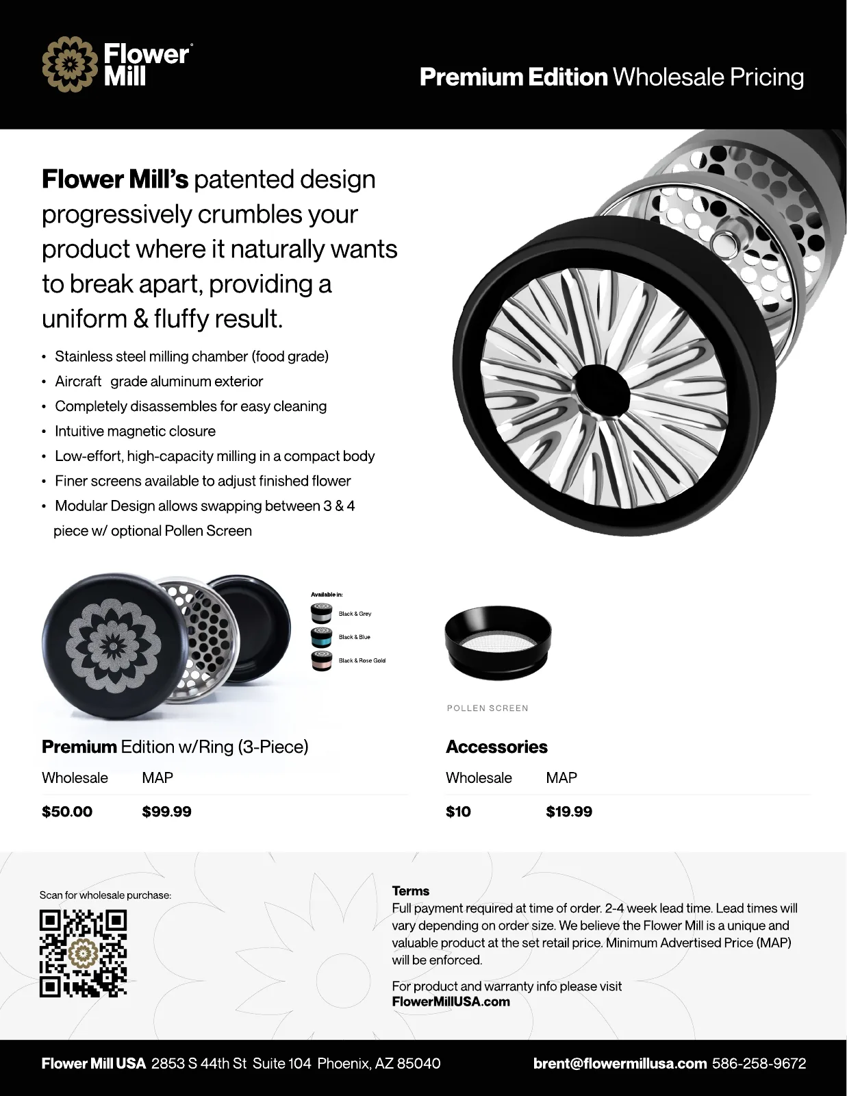
Retailers met Flower Mill on sell sheets first. Same black header, gold mark and renders as the boxes, so paper and shelf read as one brand.

Mini Edition wholesale pricing sheet
Premium Edition wholesale pricing sheet
Flower Mill pricing breakdown sheet
Delivered · Mini Edition wholesale sheet
Delivered · Premium Edition wholesale sheet
Delivered · Pricing breakdown for retailers
Flower Mill gold leaf logo for trade-show booth C2
Trade show, booth C2

The booth footer carried the gold-leaf lockup at large scale. Booth rules: white background, one product image, Neue Montreal throughout, mark top right.

11Customers

The product experience, in their words.

“
This mill is a game changer when it comes to ease of use and most importantly, consistency of the finished product.
Dana Reese · verified review
Consistency
“In my opinion this flower mill nails the perfect consistency.”
Anthony Moore · 2" Premium
Effort
“Fluffy yes, but oh so quick with little effort.”
marian · Stainless 2.0
Result
“Best out there for your flower. It mills it perfectly.”
Roger S. · 2.5" Premium
Loyalty
“My third mill and I recommend them to everyone I know.”
Michelle Morris

Reviews from flowermillusa.com, written after this project. Owners describe what the brand set out to say: consistency, low effort, a result you can see.

12A thank-you

What Apple taught me about restraint.

Apple's product storytelling set the bar I hold my work to. One object on a quiet background. One sentence that says one thing. Motion that shows how something works, then gets out of the way. Thank you, Apple.

This is personal inspiration. Apple had no involvement in Flower Mill or in this case study.

01Respect the product.
02Take away whatever doesn’t help.
03Make the important details visible.
04Let materials speak for themselves.
05Use motion to reveal, never to decorate.
06Treat every touchpoint as one experience.

The lesson wasn’t to make Flower Mill look like Apple. It was to give every detail a reason to exist.

13The result

More than an identity. A foundation for the brand.

Flower Mill Premium Edition, Black & Grey
Flower Mill exploded render
A clearer expression of quality

Real hardware, real materials, and copy that states facts.

One coherent language

The same mark, gold and grid from lid to sell sheet.

A recognizable identity

The flower works alone, on a 73 mm lid or across a trade-show booth.

Packaging that sorts itself

Colorway, tier and contents readable at a glance.

A foundation to build on

Written guidelines the team can extend without me.

Reflection

Most of this project happened in small decisions. Which way the label wraps. How much gold is too much. Whether the flower needs the word beside it. Flower Mill’s team trusted the process enough to let those decisions add up. What I took from it is simple: learn the product first, listen to the people who use it, and get everyone behind one direction before drawing anything.

When a client trusts the process, design can do more than change how a brand looks. It can change how clearly the world understands what makes it different.

Want to
see more?

Reach out and I’ll walk you through more of my work, including projects for Disney, Wolf & Shepherd, Franklin Templeton, Block One, and JPMorgan.

Reach out to view more of my portfolio work – including projects from Disney, Wolf & Shepherd, Franklin Templeton, Block One, and JPMorgan.

Current availability

We’re open for business and new collaborations.

Current availability

We’re open for business and new collaborations.

Live sites I designed