Kaiser Permanente
Refresh your state of health
UX Research
Product Design
Strategy

The care was great.
Getting to it wasn’t.
When COVID-19 moved care into people’s homes, Kaiser Permanente’s app became the front door to it. I led the redesign that rebuilt that door around members: fewer dead ends, plain language, and every task one clear step from the moment you need it.
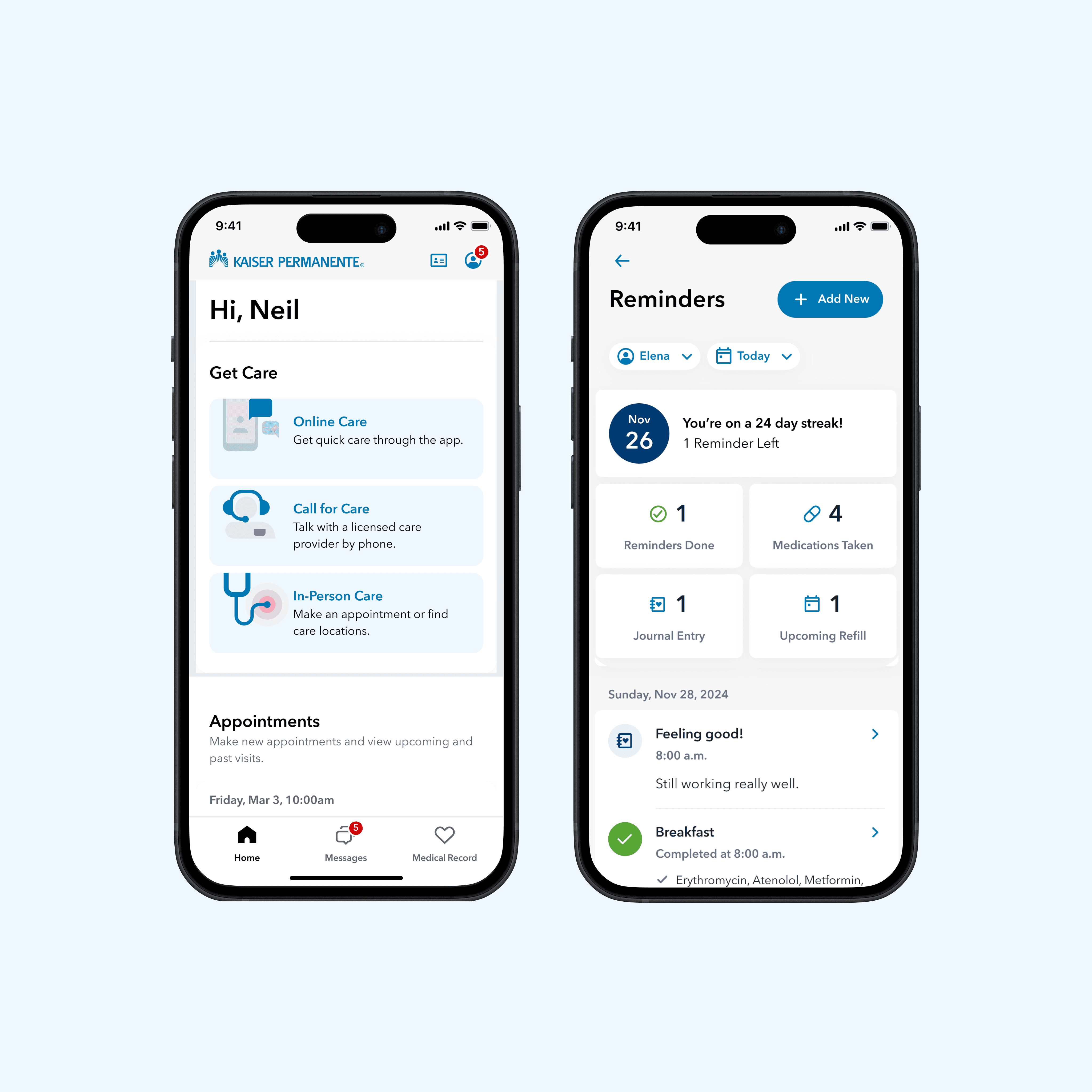
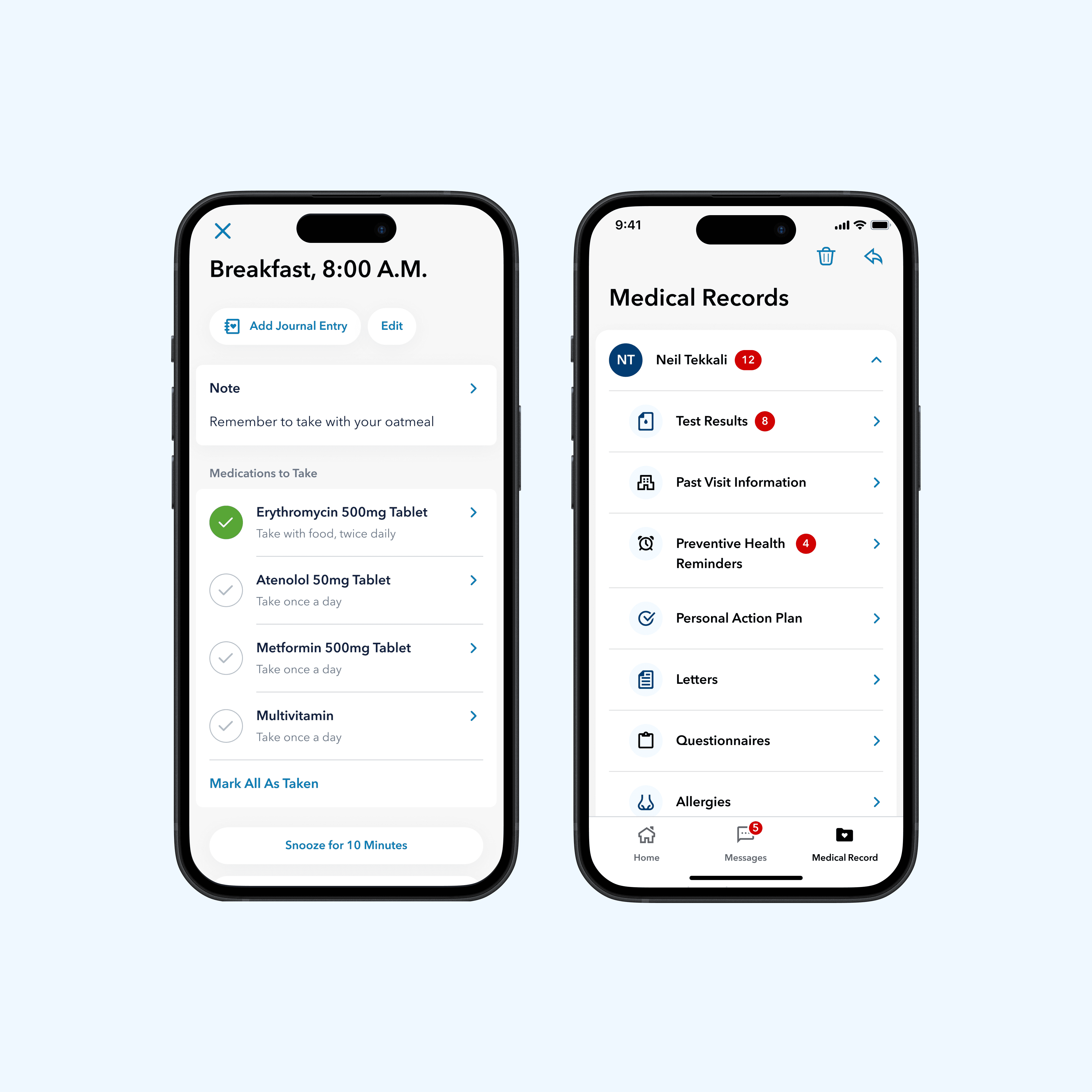

Care doesn’t stop when the visit ends. The app experience did.
Most of a patient’s health work happens at home: taking meds, refilling them, following a plan and asking follow-up questions. I started from the published research on where that work breaks down, then mapped where our app was adding friction instead of removing it.
Before the wireflow, a wall of sticky notes and one rough phone.
I ran a working session to pull the research into how-might-we questions, then sketched the Care Hub idea and a first pass at the refill reminder on paper before opening Figma.
One hub, four journeys, every task where it natively lives.
I extended the hub pattern from my GMW onboarding flow. Rather than rebuilding pharmacy and messaging inside the app, a doctor-triggered reminder deep-links into a Care Hub task. The hub hands the member off to the system that owns the task, then reports progress back so nothing is left half-done.
From reminder to resolved, without leaving the thread of care.
Each journey starts with something the doctor did and ends with the member’s task closed in the Care Hub. I designed the screens to answer one question at a time: what is this, what do I do, and is it handled?
Fewer dead ends between the doctor and the medicine cabinet.
I kept four principles in front of the team while we designed, and paired every journey with a metric we could watch after launch. The goal was never more engagement for its own sake, just fewer patients falling through the gaps between visits.
A calm, consistent kit built for care moments.
Every screen above is assembled from the Kaiser mobile design system I built: pill-shaped actions, quiet filled inputs and status patterns tuned for clarity under stress. The components below are live, so tap around.
May 2022. Care went live, right when members needed it.
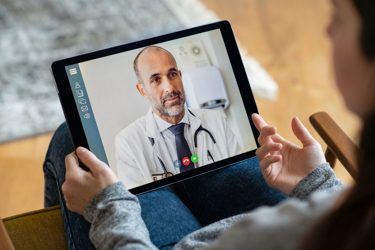
Building on the desktop platform, I designed the video visit experience end to end, alongside live support, scheduling and billing. Patients could see their doctor face to face from a phone or computer, getting started in minutes while the world kept its distance.
Everything we set out to fix, ticked off.
Most of my time went into balancing simple against secure, for patients and for the care teams on the other end. During the pandemic, video visits became a lifeline, and they put Kaiser Permanente out in front on telehealth when it mattered most.